Identity System
Eye Candy Optics is an upscale eyewear shop in Chicago's Wicker Park area, they specialize in hip and fashionable glasses and friendly professional care.
Concept
For Eye Candy Optics I wanted to use the the fun implications of the pun name in a way that focused on fashion. The identity marks needed to find a balance between the playfulness of candy and the sophistication of well designed eyewear.
Approach
The pun in the name was the starting point, I started with sketches finding ways to combine eyes, glasses and candy.
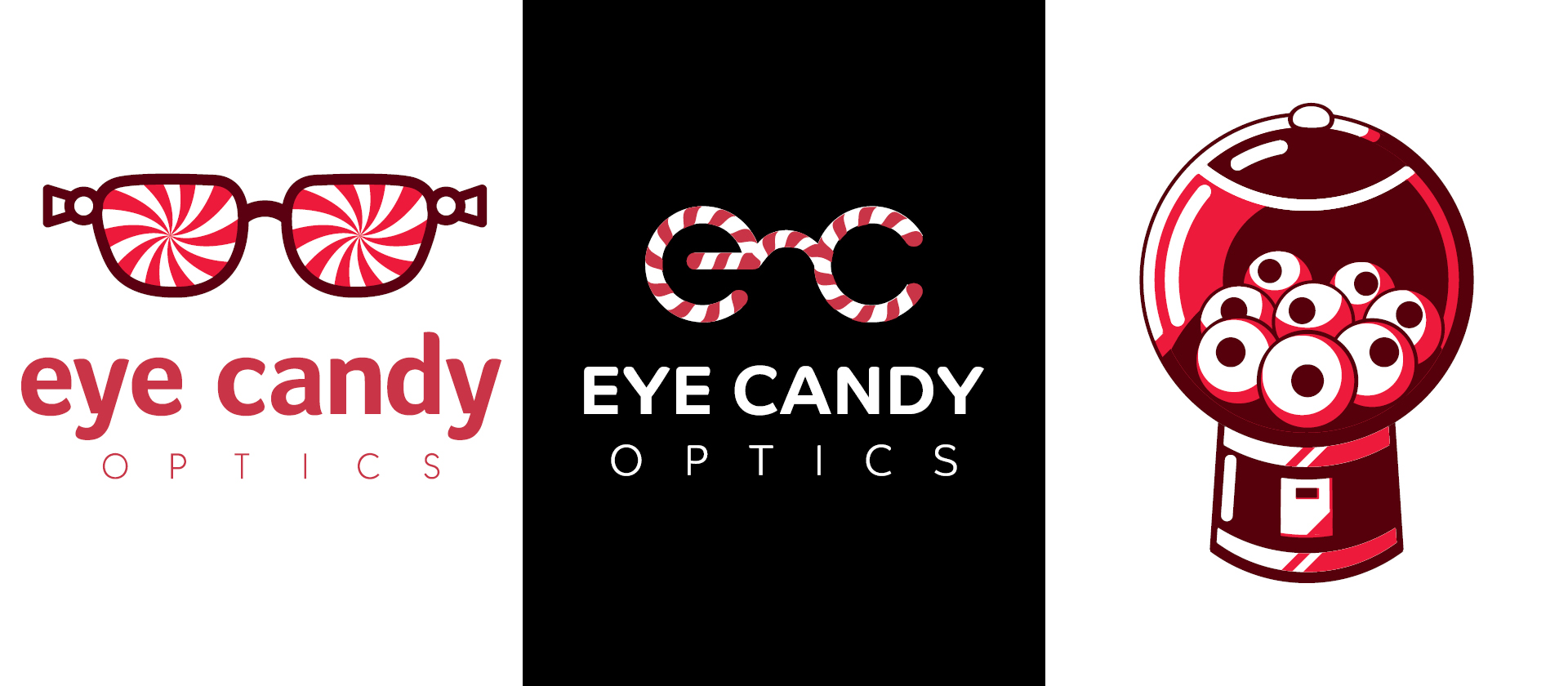
Lettermark
The lettermark links the lowercase initials of Eye Candy in a representation of a pair of glasses which are decorated with candycane-like striping. In order to maintain the focus on fashion I reduced the striping as much as possible while ensuring that the mark could still hold together when set in black and white.
Identity Marks
I created two identity marks which focus more on the hip nature of the shop, these marks are more in keeping with the ecclectic nature of the community where the shop is located. The first mark plays on the idea of glasses as a wrapper for eyes, transforming the wingtips of the frames into the ends of a twisted candy wrapper. The lenses of the glases are replaced with a candy swirl, reinforcing the connection between the glasses and candy in a semi-hypnotizing way that shows the fun and friendly atmosphere of the establishment. The second identity mark is more enigmatic, a gumball machine filled with eyeballs is a little bit creepy but fun. I felt this mark could be expanded as part of a system using a set of intriguing marks combined with an equally playful typographic system into an appealing identity system.
Stationery
The stationery system was created using the lettermark because it seemed the most in keeping with how the store seemed to be portraying itself from the research I could gather. The striping from the mark is repeated as a rule dividing the space of the letterhead, business card and envelope. The typography is designed to match with the logotype that I designed to lock-up with the lettermark.