Outcome
In creating a menu and identity for Cups and Crepes I wanted to focus on evoking the feeling of a relaxing brunch and the delicate texture of a crepe.
Concept
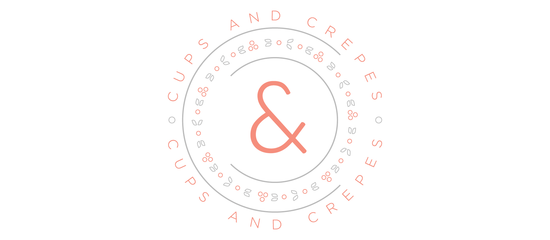
I wanted the menu to reflect the quiet atmosphere of the Victorian-era house which houses Cups and Crepes, focusing on delicate details and quiet typographic treatments. I also took inspiration from the decoration of tea cups and saucers as a way to add character.
Typography
I wanted to make the typography of the menu fairly sedate and relaxing to look at and let the descriptions of the different plates be what compells a customer to try a particular dish. I chose to combine a light weights geometric sans-serif with a delicate slab-serif typeface to provide a variety of texture. The type is colored in light and mid-gray with a few places of coral to hint at the light texture of a crepe.
Color
I chose a coral color as a way to reference the filling of a sweet crepe without specifiying a particular type of berry. The coral also works to compliment the warm grays and the light creme tint of the paper.
Graphic Elements
The graphic elements are geometric abstractions of non-specific berry plants. These were inspired by tea cup decoration, but are simplified and geometric to keep with the delicacy I wanted to evoke. The berry elements are repeated as dividing elements in the typography to indicate where prices are stated.