
An original guidebook to effectively using the typeface Gill Sans, along with a brief history of one of the world's most famous typefaces.
Type Specimen Books (school project).
Perfect Bound Book
The book is designed using only the typeface Gill Sans, it's meant to be both a guide to how the make the best use of the font and showcase places which make the best use of the typeface. Gill Sans has been used poorly many times it has given the typeface something of a negative reputation, especially when the ultrabold comes into play. This book is meant to restore the reputation of the typeface, even if its creator is irredemable.
This piece was included in the DSVC's National Student Show & Conference 12 April 2016


Initially I was somewhat apprehensive about working with Gill Sans given how often it has been misused, but with some historical research I was able to create a satisfying book showing the best uses of the typeface in practice.
These type specimen books are meant as a way to show off the best ways to use the typeface and help designers decide whether or not they're correct for their project, providing tips on how to avoid pitfalls. They are also meant to provide some historical background information into the typeface so designers know what possible allusions they may be making by choosing a particular typeface.
I decided that given Gill's long history it was important to focus on that in the opening before going into the details, these sections were followed by pages showing real world examples of the where Gill Sans has been used well.
The entire book is set using Gill Sans in order to show how to best use the typeface in a publication, Gill Sans wouldn't be my first choice for body copy, but fortunately the humanist design of the lowercase helps it retain legibility at smaller sizes for captions. The wide variety of weights available help create variations in typographic texture which is one of the benefits of using gill in a publication.
The colors of the book are based on old Penguin Books which used Gill Sans on their covers, the cover of the book is a pastiche of these covers. I chose to restrict the colors to orange, cream and black because of the relationship of Gill Sans to the iconic Penguin Books covers. I used the cream color as a way to highlight specific areas of information and as a way to liven up the primarliy typographic pages, these also helped divide the space more clearly.
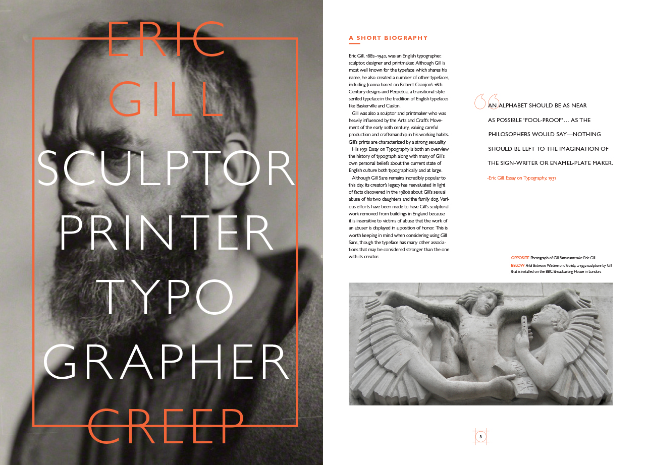
I wanted the main images to be created using the glyphs themselves rather than illustrations or photographs. The images that are used are primarily photographic and are focused on how Gill Sans is used with them, but I did include an image of Eric Gill and one of his sculptures to provide greater context, along with an image of a boxer as a way to give the pun in Gill Kayo a little more "punch".
View All Spreads


Gill Sans interesting history and its prevalence as the national typeface of England informed the way I approached creating this type specimen's contents. This project was heavily influenced by the information I was able to find about the history of Gill Sans and its creator Eric Gill, research played a very important role in this project.
Interestingly, before being assigned our typefaces, Gill Sans was given as an example of a typeface that was often used poorly, I was last to choose what my project would be and was left with only Gill Sans, I decided to take this as a challenge to show the best side of a much maligned typeface.
My process for creating this publication was based around finding out the most interesting aspects about Gill Sans design, I read as much as I could find about both the history of the typeface and the story of Eric Gill. Finding out about Gill's sordid history added an interesting aspect to the project; in many ways, despite bearing its creators name, Gill Sans has become a separate entity from Gill the person by its widespread use. I decided it was ethically necessary to address Gill's personal history even though it made it more difficult to try to portray the typeface in a positive light. I took the editorial stance of condemning Eric Gill and his actions, but decided that perception of Gill Sans is more a product of how it has been used than the life of its creator. The details about Gill's abusive nature weren't revealed until much later, so I thought it was unfair to the institutions that made the decision to use Gill's typeface without that knowledge to condemn use of the typeface. In retrospect, I think I might have found a way to include a recommendation to avoid the use of Gill Sans in light of the actions of Eric Gill, but I didn't include this at the time because it was counter-intuitive to the intentions of creating a type specimen book.
I wanted to show both the unique aspects of Gill's original design along with the many interesting variations that occur in the various weights that were designed later on. The wide variety of weights and styles and the strange quirks between the different designs informed the thinking in how content was generated an displayed on the page. I wanted to highlight the places where aspects of the design varied in interesting ways. I also wanted to give examples where Gill had been used well in order to encourage certain approaches, and hopefully discourage unthoughtful use.


