
A redesign for the grocery chain ALDI using a new identity system designed to emphasize the ALDI's commitment to efficency and order.
ALDI (school project, professor Alex Egner).
Identity System, Stationery Set, and Perfect Bound Book.
After designing a new brand identity system for ALDI it was important to create a series of guidlines for how the new identity was meant to be implemented. The book walks anyone who would be utilzing the new identity system through the do's and don't's of the new identity. The book itself is laid out using the same modernist design principles which influenced the new identity system. The brand book is intended to keep uses of the aldi brand identity clean and effecient to match the way ALDI stores function with their emphasis on removing obstacles in order to create the best shopping experience.


Letterhead & Envelope


Brand Identity Guide
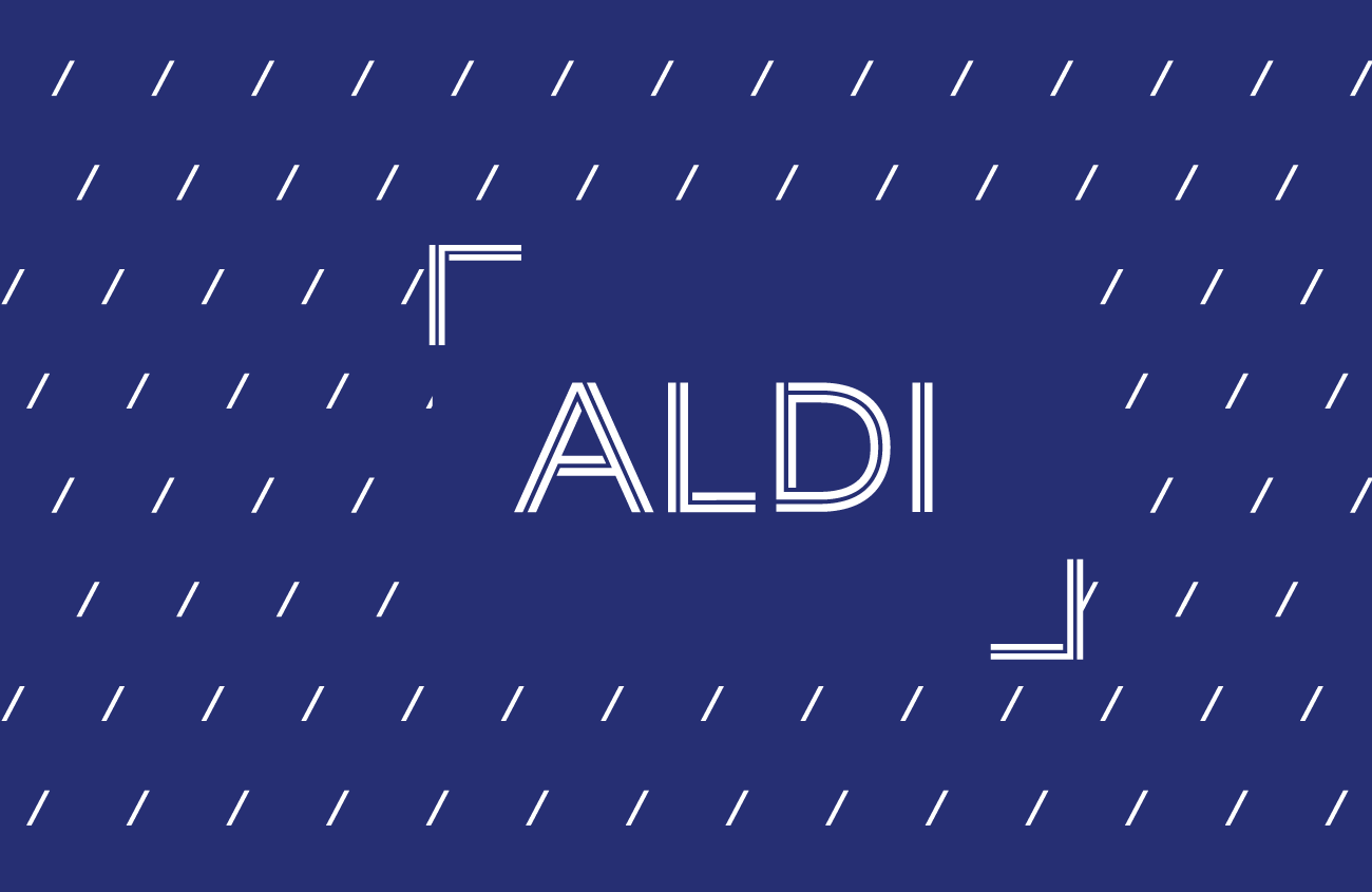
This redesign of the ALDI identity mark takes aspects of the old lettermark and works them into a new logotype which compliments their desire to simplify the shopping experience.
The main idea behind the new mark was to simplify the elements of the previous identity in a way that expresses simplicity and efficency. I wanted to strip out the excess of the original, but retain the recognizable elements.
I decided that the repeated lines and the color scheme should be retained to maintian the brand equity, but reordered how they were used.
The new logotype was based on a sans-serif type and uses the lines from the lettermark from the previous design. The repeated line is now only repeated twice is now woven into the letterforms spelling out ALDI, the weaving is meant to represent how ALDI links efficency and value. This eliminated much of the unecessary excess of the original and reduced the mark's visual footprint while also giving it a more serious apperance.
I decided to use the same colors except for orange from the existing logotype, but instead of having them all be featured in the logotype they would be used on their own throughout the different brand extensions. Because the dark blue color was already dominate it was chosen as the primary color to be used for both corporate branding and when the ALDI logotype needed to be immediately recognizable.
I used the same woven line to create corner brackets which appear in lock-up with the ALDI logotype. These help provide negative space around the logotype, but can also be used throughout the brand as a way to callout specific images. I also used a series of forward slashes which match the angle of the A as a repeating pattern that can be used for different applicationions of the ALDI brand.


Creating a brand for a company like ALDI was interesting because of their unique position in their industry that is remarkably different from other grocrery chains.
ALDI was not a brand I was familiar with before this project, the chain having just recently expanded into the Texas area with only a few locations. I looked up as much information as I could and visted the local store in order to better understand what ALDI's goals were. I thought the store's approach to keeping prices low by focusing on eliminating excess and optimizing the efficency of the shopping experience made them unique and was an important part of the brand.
A logotype seemed like the most appropriate type of mark for ALDI because it is currently an expanding competitor in the grocery market and needs to build name recognition in new areas. Keeping in mind the efficency the brand emphasizes, I wanted to keep the marks efficent too. The two main approaches were an interweaving sans-serif that referenced the old lettermark, and a barcode which referenced the fact that many ALDI products have multiple barcodes in order to speed up the checkout process. The barcode was ultimately dropped becuase it felt overly complicated.


ALDI's focus on streamlining the customer experience and maximizing efficiency informed the structure of the brand guidelines book.
ALDI is focused on minimizing excess to make the shopping experience fast and easy, I wanted this to be reflected in the way I created the brand guide. It made sense to follow modernist principles in determining the structure of the pages.
I chose to use a modular grid layout which reflects ALDI's commitment to simplicity. There is a small amount of decoration taken from the logotype in the corner of each page, although this in someways breaks from the modernist basis, it helps the active the page and ties the book together with the new design.
The book uses only one typeface throughout with mathematical attention to shifts in the scale in order to maintain a consistent structure while adding visual interest.
The colors of the book come from the slogotype colors using the dark blue throught most of the book because it is the primary logotype color, and occasionally the light blue as caption information. The restricted color pallete is part of the modernist approach, but helps keep the customer friendly feeling.
View All Spreads


After creating the new brand identity system I was familiar with how the ALDI brand should be presented, so I had a good idea of how I wanted to structure the publication.
From the start I knew that given how I had created the new identity marks that I needed to focus on simplicty and clairity, so I knew that a modernist approach would be the most appropriate way to handle the layout of the book.
I began with layout thumbnails based around a few modular grids, the grid based on the dimensions of the logotype seemed the most appropriate and provided a variety of options for laying out content.
After looking at examples of other brand guides I assembled a list of the things I needed and wanted to show in the book in order to ensure the new identity system would be implemented correctly. From that list I used the marks I had created and determined how best to show the things I needed to convey within the grid structure. I also worked on writing copy within the spaces I had provided, keeping the language clear and easy to understand.
After the basic structure was determined I was able to place content into the pages by following the rules I established. In someways at this point the layouts built themselves, my next task was to find ways to vary the typographic treatment in order to increase the visual sophistication without betraying the strict rules I was working within. I focused on small changes between different types of information to create subtle variations.


